

Refreshing a website is always a task that seems to constantly be on the mind of any creative, marketeer, brand guardian or business owner, but as a Creative Director, for me it is always a project which starts out asking more questions – far beyond a simple refresh.. sometimes there arises an opportunity to widen the scope and grasp the moment to push a brand that little bit further.
That is what happened with our new Facets website. As a creative consultant for Facets I was asked by the business stakeholders to look at a new website design for the company. Now unaware wether it is my OCD or creative nature to continue to drive forward, my mind immediately turned to ‘well what if it can be a bit more than that?’. Sat in my studio in North Manchester I pondered the age old balance of just getting the design refreshed or finding a way to explore the brand proposition, messaging, visual identity and of course the structure of the site without it taking lightyears to deliver. It is always of vital significance that in business today you deliver as quickly and efficiently as possible. So I sat down and prepared my recommendation for the new deliverables;
1) Look at the Brand Marque (logotype) and refine
2) Look at the brand proposition
3) Look at the endline
4) Look at the creative direction and visual assets
5) and of course, Look at the website design, build, structure and UI / UX.
The initial presentation to Guy and Pete was based on a simple walkthrough of the logic of the brand, it’s clear three channels, and how we could define what the company does succinctly and how that could be represented creatively. This was presented as a simple wireframe and 2 page ‘Style Setter’ document that is, in my opinion, vital to start and project of this manner.

‘Mate, I Love It!’ was the response. “Wow.. that’s a decent reaction” I thought, and what follows there is what any creative strives for and thrives upon – knowing they have hit the button dead centre to begin with. That provides the confidence and tenacity to carry on at pace, being brave enough to suggest new ideas and knowing that there is the belief and also intelligent strategy behind it to back it up.
So, next I began work on refining the logotype, which already was a lovely piece of typography. I spotted an opportunity to refine and stylise the letterforms even more and, once again, continue to drive it forward. Logo – Signed off first time.

Next followed the base copywriting for the endline and the way of representing the three growth channels of the business. Here we had a fantastic period of collaboration, a couple of round of feedback. Nothing too tiresome, just the team working together, being brave enough to suggest tweaks and humble enough to try them – and within a few days the ‘base copy’ was agreed.
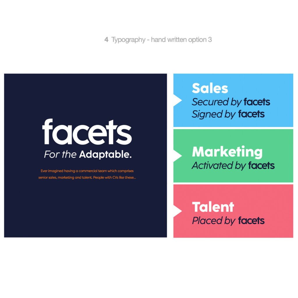
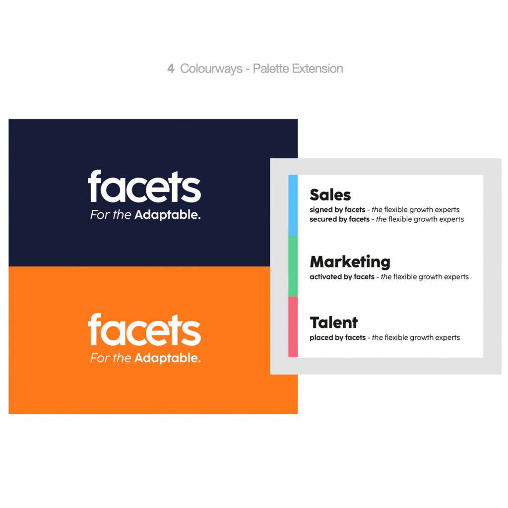
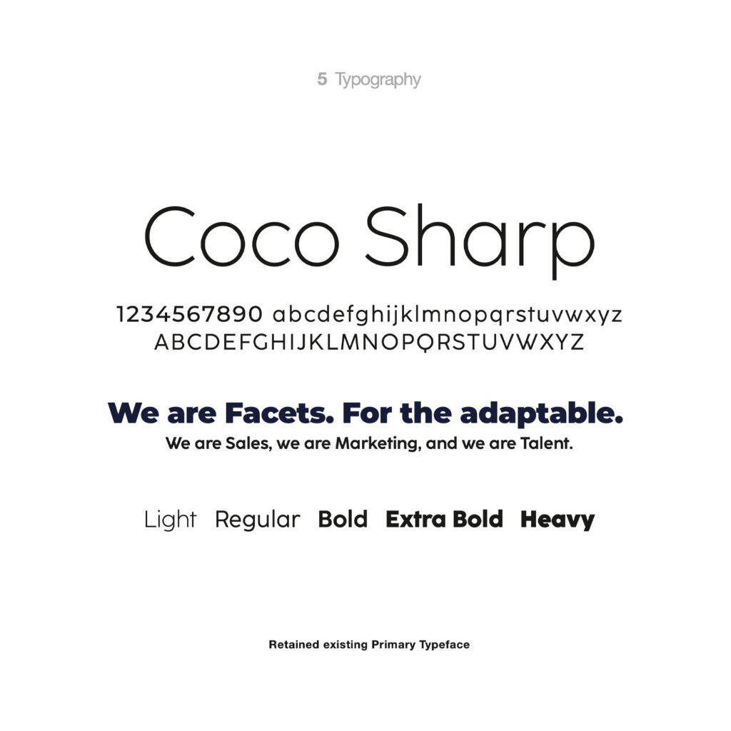
As I progressed onto the visual style, the words at the forefront of the brief were ‘modern, professional, vibrant’ – with the greatest respect all easy enough to say but not that easy to represent and get the style bang on first time. The colours worked well with one set of comments we settled on a 6 strong colour palette of Navy and Orange as primary colour ways, with Aqua, Cerise and Cyan making up the secondary palette representing the growth channels. Typography, again, a massive passion of mine – maybe to geek levels of obsessiveness was wonderfully swift and smooth to agree upon. Retaining the brand typeface Coco Sharp, but maxing it with a more personable hand-written style to offer contrast and personality. Key to this were 3 pieces of typographic art that we created to represent Sales, Marketing and Talent consistently. Mixed with verbs to show the work being done by Facets was of real value and delivered by an industry expert.
Now, we came to looking at imagery and visual padding for the site. Sadly, with budgets for large scale conceptual photography these days being rarely even discussed (rightly so in most cases in my opinion) we were to explore the offerings to us. Create a visual style or explore stock photography and look at ways which we could tweak and develop to create an own able style. After a few days of searching for applicable stock shots, we formed and discussed and developed the idea of using the business work to develop a visual style.
“a larger number of small facets preserves the size of the gem” – dictionary reference of “facet”.
What followed was a few days creating and manipulating a series of illustrations and backgrounds that we diverse and changeable enough to be used throughout the website without it looking like a one-trick pony. To do this we design 4 ‘Faceted Illustrations’ and composed them on top of carbon-sequel backgrounds to create the light and shade contrast and offer a visually striking starter for each page.

The website pages and the design development thereafter was plain sailing. As a creative, brand director, art-director, designer, whatever I am called with almost 30 years experience – it goes without saying if you get the above brand elements nailed then it is impossible to fail with the designs. What is crucial however at this point is keeping the editorial ideas and messaging as on-point and uniques as possible. So ‘team profile’ pages were focussed on who people are inspired by? their personal values? their traits.. all more interesting than a business CV (although that was also included – alongside phone and email and WhatsApp links.. form and function and funk working together in perfect harmony.
That to me as a relatively new member to the Facets part-time consulting team sums up my thoughts on the people and the business that is smashing thier way through client success.
Form – its a innovative business model.
Function – it’s run by seriously talented people.
And Funk – they are fun to work with and have a novel approach to collaboration.
Welcome to the new dawn. Facets relaunched.